Electrician Website Design Strategies for Faster Mobile Conversions
If you work with electricians long enough, a pattern jumps out fast. Most mobile visitors are not browsing for fun. They have a tripping breaker, a dead outlet, a panel question, or a job they need priced. They are standing in a kitchen, driveway, or mechanical room with a phone in one hand, and they want one thing above all else: an easy next step.
That changes how electrician website design should be approached.
A pretty site can still underperform if the mobile experience slows people down. On the other hand, a straightforward site with strong structure, fast load times, obvious contact options, and real proof of work can convert surprisingly well. Google’s own guidance for contractor and home service sites points in that direction. Keep the important information above the fold, simplify navigation, avoid heavy pop-ups, and make pages load quickly on phones. For electricians, those basics are not nice extras. They are the conversion engine.
What follows is a practical look at how to build for speed, trust, and action, especially on mobile, where a big share of local service searches happen.
Mobile conversions start with urgency, not aesthetics
Electricians sell reassurance as much as service. A homeowner with flickering lights may not know whether it is minor or serious. A property manager dealing with a failed circuit wants availability, professionalism, and a fast response. A contractor seeking a bidding partner wants credibility and clarity. In every case, the website has to answer stress with simplicity.
That is why the homepage hero matters so much on a phone. If the first screen is dominated by a giant stock photo, a vague slogan, and no contact action, conversion drops. The visitor should immediately see who you are, what you do, where you work, and how to reach you. Not after scrolling halfway down. Right away.
Good contractor website design often borrows from direct response thinking. It removes friction instead of adding flair. In website design for contractors, especially trades with urgent calls, every extra tap is a chance to lose the lead. Electricians feel this more than some other trades because electrical issues often create immediate concern. The person searching may compare only two or three providers before calling one.
A strong first mobile screen usually does a few things at once. It names the service clearly, references the service area, presents a visible call button, and gives a second option for people who do not want to call yet, such as a short quote form or message request. Google’s mobile guidance supports this kind of setup by emphasizing fewer steps to complete actions.
The homepage should answer four questions in seconds
Many websites for contractors bury the essentials under designer preferences. The result looks polished on desktop and awkward on a phone. Electrician sites tend to do better when the structure is plainspoken.
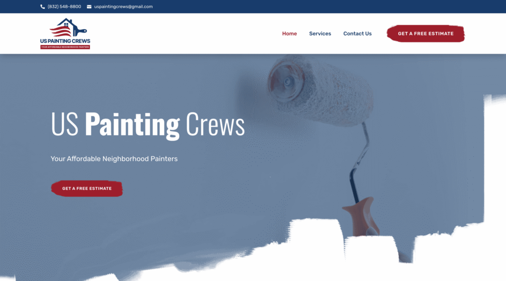
A mobile visitor usually wants quick confirmation on four points. First, do you handle the service they need. Second, do you serve their area. Third, can they contact you immediately. Fourth, can they trust you enough to make the call.
Those answers do not need long explanations on the first screen. Short, direct wording performs better than clever phrasing. “Residential and commercial electrical service” says more than a slogan about powering the future. “Serving the greater service area” is more useful than a mission statement. “Call now” or “Request service” works because it is specific.
This is one reason home service website design benefits from restraint. Every piece on the page should support action. Pop-ups, sliders, and elaborate animations can compete with the primary job of the page, which is to get a prospect into a conversation.
Faster mobile pages usually win more calls
Speed is not a luxury for electricians. Slow pages lose visitors, especially on phones. Google has been consistent on this point. If mobile pages load slowly, people leave. In the field, that often means the lead goes to the next business they found in search.
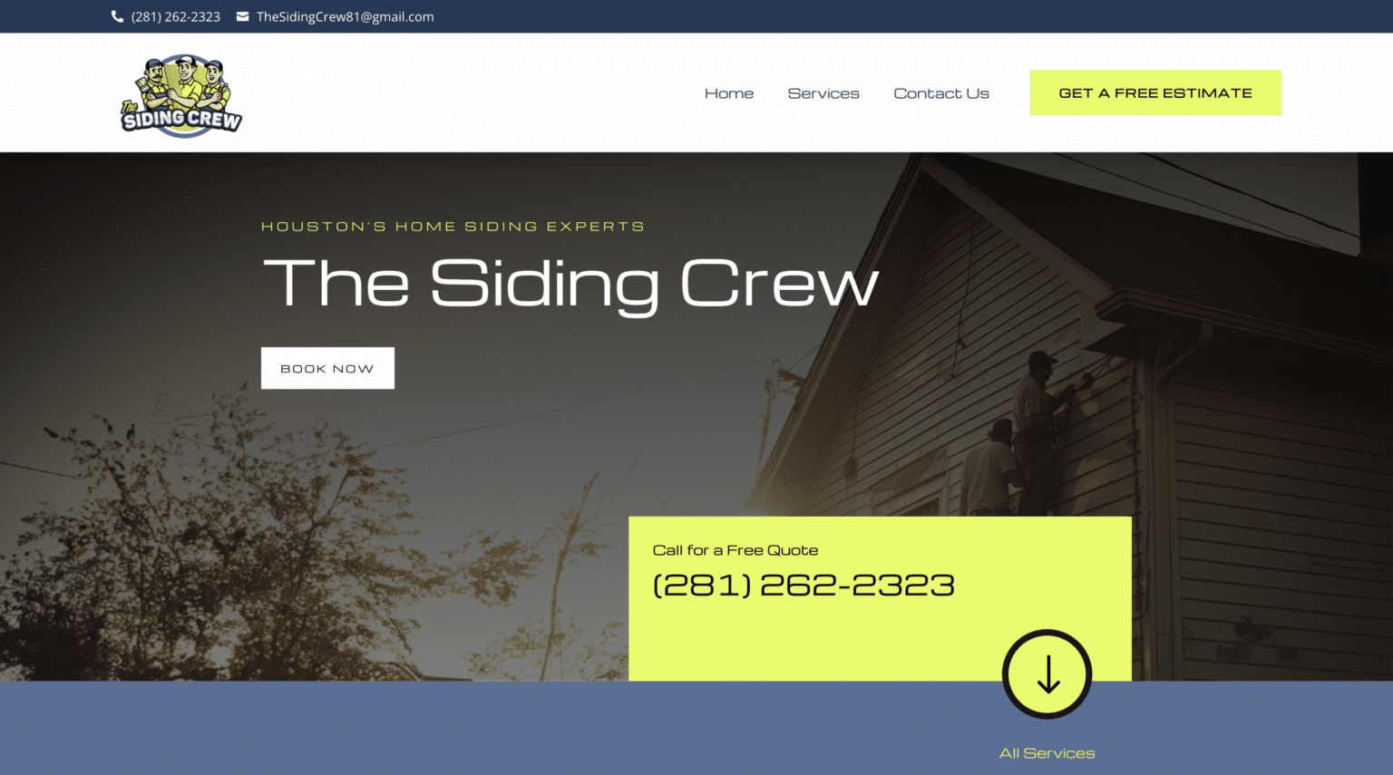
A lot of contractor sites get weighed down by oversized images, unnecessary motion, and too many scripts. Real project photos help trust, and they should absolutely be used, but they still need to be handled responsibly. Uploading huge, unoptimized images from a phone or DSLR straight into a gallery is one of the easiest ways to sabotage mobile conversions.
This creates a practical trade-off. Real photos are valuable because Google encourages photos in local service contexts and because prospects respond better to actual work than generic stock art. But authenticity does not require a bloated page. The better approach is to use fewer, stronger images in the right places. One clean truck shot, one team photo, one panel upgrade photo, and one finished fixture installation often outperform a cluttered carousel of twenty loosely chosen images.
The same logic applies to page length and visual effects. There is nothing wrong with a long page if it earns its space, but mobile pages must still feel quick and navigable. A site can be informative without becoming heavy.
Click-to-call should never be hard to find
For many electricians, the fastest path to revenue is still a phone call. If a visitor wants to call, the site should not make them search for the number, pinch to zoom, or tap through multiple screens.
A sticky call button on mobile can help, but only if it is not intrusive. The broader point from Google’s guidance is that actions should take as few steps as possible. That means obvious tap targets, clear labels, and minimal distractions between intent and contact.
Some businesses worry that putting a phone number front and center will reduce form submissions. In practice, the two options can serve different buyer types. People with urgent issues often call. People price shopping after hours may prefer a short form or messaging option. Both should exist, but the mobile design should respect urgency first.
There is also a missed opportunity many electrical sites overlook: after-hours inquiries. Google’s Local Services Ads guidance notes that enabling messaging or booking can improve the likelihood of getting leads when the phone is not answered. That principle carries over to the website. If your office is closed, a lightweight message option gives prospects somewhere to go besides back to search results.
Short forms beat ambitious forms on mobile
Every field you add to a form asks the visitor for more effort. On desktop, people sometimes tolerate that. On mobile, they are far less forgiving.
The best lead generation websites for contractors usually keep the first form short. Name, contact info, service need, and maybe location are often enough to begin. Long intake forms may feel efficient internally, but they can depress conversions if they appear before trust is established.
This is especially true in electrician website design because many first contacts are exploratory. A person may not know whether they need troubleshooting, a panel change, or a dedicated circuit. Asking them to classify the job in too much detail before a conversation can create hesitation.
A smart compromise is to use a short initial form on high-intent pages and gather fuller details later during the follow-up. That respects the way mobile users behave. It also aligns with Google’s emphasis on fewer steps for mobile actions.
Here are five mobile conversion elements worth prioritizing first:
- A visible click-to-call button near the top of every key page
- A short contact form with only essential fields
- Service area language that confirms where you work
- Real photos and review signals that reinforce trust
- Fast-loading pages with simple navigation and no heavy pop-ups
Service pages should match how people actually search
Electricians often try to say everything on one general services page. That can make the site feel broad but vague. It is usually better to create focused pages around meaningful service categories, then keep the mobile layout simple within each page.
This matters for conversions and visibility. Google’s mobile-first indexing guidance makes it clear that mobile pages need to be crawlable, consistent, and usable. If your site has thin, confusing, or hard-to-navigate service content on mobile, that can create problems beyond user experience.
It also matters for local SEO for contractors. A person searching for “panel upgrade electrician” is in a different mindset than someone searching for “ceiling fan installation” or “electrical troubleshooting.” Separate, clearly named service pages help the site feel more relevant to specific needs. They also make it easier to write headlines and calls to action that match search intent.
That same principle carries across trades. Roofing website design, HVAC website design, and plumbing website design all benefit from strong service segmentation. The difference for electricians is that the technical nature of the work can intimidate prospects. Clear, plain-English page copy helps reduce that friction.
A service page should Scalable Websites website design not read like a code manual. It should sound like a competent shop explaining what it does, where it does it, and how to get help.
Local proof matters more on a phone than many owners realize
Trust on mobile is compressed. The visitor is not studying your company for half an hour. They are scanning. That means proof needs to be immediate and credible.
Google Business Profile gives service-area businesses a way to define service area, choose the right category, and link the website. Those basics support local relevance. On the website itself, the same local clarity helps conversion. Mentioning the actual communities served, in a natural way, reassures visitors that they are in the right place.
Reviews matter here too. Google encourages businesses to read and reply to reviews, and those review signals can reinforce trust when echoed on-site. A short review section on key pages can help, especially near a quote form or call to action. What matters is authenticity and readability. A handful of believable, service-specific reviews often carry more weight than a giant wall of generic praise.
Photos are another underused trust lever. Google’s Local Services Ads guidance supports the value of quality photos. For an electrician, strong photo choices might include a branded vehicle, a clean panel installation, a technician at work, or a well-lit before-and-after shot. Good photos do more than decorate the site. They answer an unspoken question: does this look like a real business I would feel comfortable inviting onto my property?
Navigation should feel boring in the best possible way
When a contractor says they want a “modern” site, they often mean they do not want it to look dated. Fair enough. But on mobile, modern should not mean experimental.
Simple navigation converts better because stressed visitors do not want to solve a puzzle. A tight menu with core pages is usually enough. Home, services, service areas, reviews or about, and contact will carry most small to mid-sized electrical businesses just fine. The more options crammed into the menu, the easier it becomes for people to drift instead of act.
This is where some contractor web design company pitches go wrong. They sell complexity as sophistication. In reality, websites for contractors need discipline more than novelty. A mobile user should be able to understand the site structure in a glance.
Heavy pop-ups deserve special mention. Google advises avoiding them when they interfere with the user experience. Pop-ups can occasionally work for a timely offer, but they are often overused in home service website design. On a phone, an aggressive pop-up that appears before the visitor has even read the first screen can feel like a roadblock. If you use one at all, it should be delayed, easy to close, and secondary to the main contact options.
Your Google presence and your website should support each other
A website does not convert in isolation. For local service businesses, it works alongside Google Business Profile and, for some companies, Local Services Ads. The details should line up. Services offered, service area, hours, and contact methods need consistency because prospects often bounce between the profile, ad unit, and website in a matter of seconds.
If your Google presence says one thing and your site says another, trust leaks out. If your profile shows service areas but your site does not clearly mention them, some visitors will hesitate. If your profile suggests messaging is available but your website forces only a phone call during office hours, you may lose after-hours leads.
That does not mean every channel needs to look identical. It means the experience should feel coherent. The prospect should move from search result to profile to site without confusion.
Design choices that look expensive can hurt results
There is a temptation in contractor website design to chase the features owners notice rather than the features customers use. Fancy motion effects, cinematic videos, and oversized image blocks can make a site feel expensive. They can also slow the page, bury contact options, and frustrate mobile users.
That trade-off is worth talking about honestly, especially when contractor website cost comes up. A higher price does not automatically buy better conversion performance. Sometimes it buys more visual production. For electricians who depend on mobile leads, the better question is not “How elaborate is the site?” It is “How quickly can a qualified visitor contact us on a phone?”
That is one reason some businesses consider managed website setups from firms that focus on contractors. As one example, there are providers that publicly position themselves around monthly website subscriptions for home service contractors and include items such as hosting, security, updates, and project management. Whether that model makes sense depends on the business, but the bigger point is practical: ongoing maintenance matters. Fast mobile performance is not a one-time launch task. Sites drift. Images get added, plugins accumulate, pages multiply, and speed can decay.
The pages that usually move the needle fastest
Not every page deserves the same effort. For electricians trying to improve mobile conversions, a few page types usually matter most.
The homepage is the traffic director. Service pages capture specific intent. The contact page should remove every possible barrier. Review and about pages build confidence, especially for bigger-ticket jobs where buyers do a little more checking before reaching out. A service area page or naturally written local references can help reinforce local relevance without overcomplicating the site.
One useful test is simple: open the site on your own phone and try to become a lead in under thirty seconds. If you have to hunt for the number, if the form asks too much, if the images drag, or if the navigation feels crowded, the visitor is feeling that too.
Five common mobile mistakes show up again and again on electrician sites:
- The phone number is hard to find or not tappable
- The homepage opens with branding language instead of service clarity
- The form is too long for someone standing on a jobsite or in a kitchen
- The page is slowed down by large images, video, or intrusive pop-ups
- The site does not clearly state the service area or match local search intent
Better conversion usually comes from subtraction
When an electrician site starts underperforming, owners often assume they need to add something. Another badge. Another section. Another design feature. More often, they need to remove friction.
Strip away anything that competes with contact. Tighten the headline. Shorten the form. Compress the image load. Simplify the menu. Bring the trust signals closer to the call to action. Make sure the mobile version contains the same important content and usability as the desktop version so it remains strong for users and for mobile-first indexing.
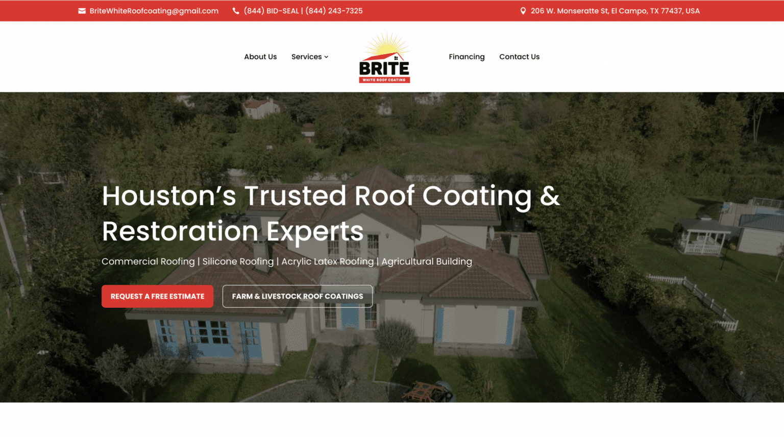
That is the practical heart of website design for contractors. The site does not need to impress a designer. It needs to help a real person with a real need choose your business quickly and confidently.
For electricians, that usually means building around urgency, clarity, and trust. If the page loads fast, explains the service plainly, confirms the location, shows proof, and offers an easy next step, mobile conversions tend to improve. Not because of a trick, and not because of trend chasing. Just because the website finally respects how customers behave when they need electrical help now.
About Scalable Websites
Scalable Websites builds professionally designed, AI-powered websites for roofers, HVAC companies, plumbers, electricians, remodelers and other home service contractors, with hosting, security, unlimited updates and lead capture included in one monthly plan.
396 Mallorn Lane, Montgomery, TX 77316
Phone: (832) 979-2478
Website: scalablewebsites.com
About Scalable Websites
Scalable Websites builds professionally designed, AI-powered websites for roofers, HVAC companies, plumbers, electricians, remodelers and other home service contractors, with hosting, security, unlimited updates and lead capture included in one monthly plan.
Houston, TX · Serving contractors nationwide
Phone: (832) 979-2478
Website: scalablewebsites.com